
DASH Engineering
Transforming an inconsistent brand into a cohesive marketing system, built to match the caliber of the work behind it.
Taking an established engineering company from inconsistent marketing to a cohesive brand built for growth.
Marketing Strategy / Brand Strategy / Web Design / Content / Lead Generation / Business Development
THE CHALLENGE
DASH Engineering was doing sophisticated work for major manufacturers, but its outward-facing brand didn't reflect the caliber of the company behind it.
Marketing had no dedicated owner. The website was sparse, messaging varied from one touchpoint to another, and sales materials were created as needed without a consistent visual system. There was no established content cadence or lead-generation infrastructure.
The challenge wasn't to reinvent DASH. It was to make the way the company showed up match the quality of the work it was already doing.
THE APPROACH
Build the system, not just the assets.
Rather than treating the website, social media, sales materials, and business development as separate projects, I built a marketing strategy designed to connect them.
Existing brand elements were developed into a usable visual and verbal system, messaging was clarified, and an annual marketing calendar established a consistent cadence across channels.
From there, the focus shifted from simply having marketing to using it intentionally to build awareness, demonstrate expertise, and create new business opportunities.
BRAND + MESSAGING
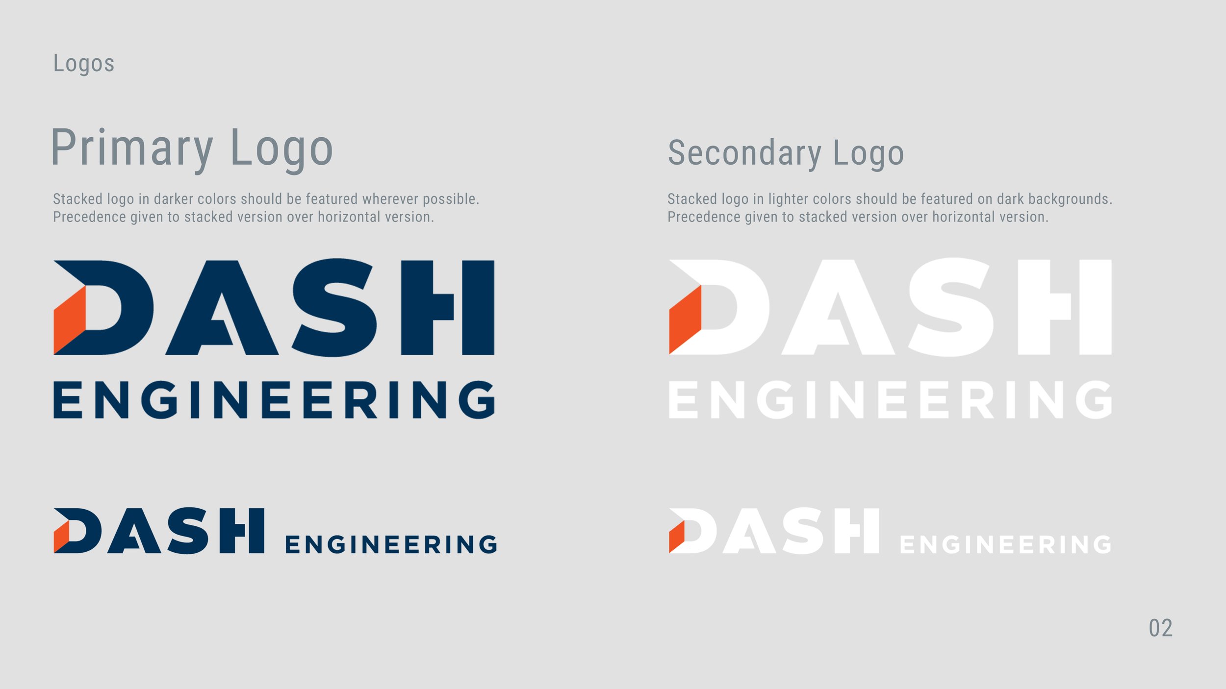
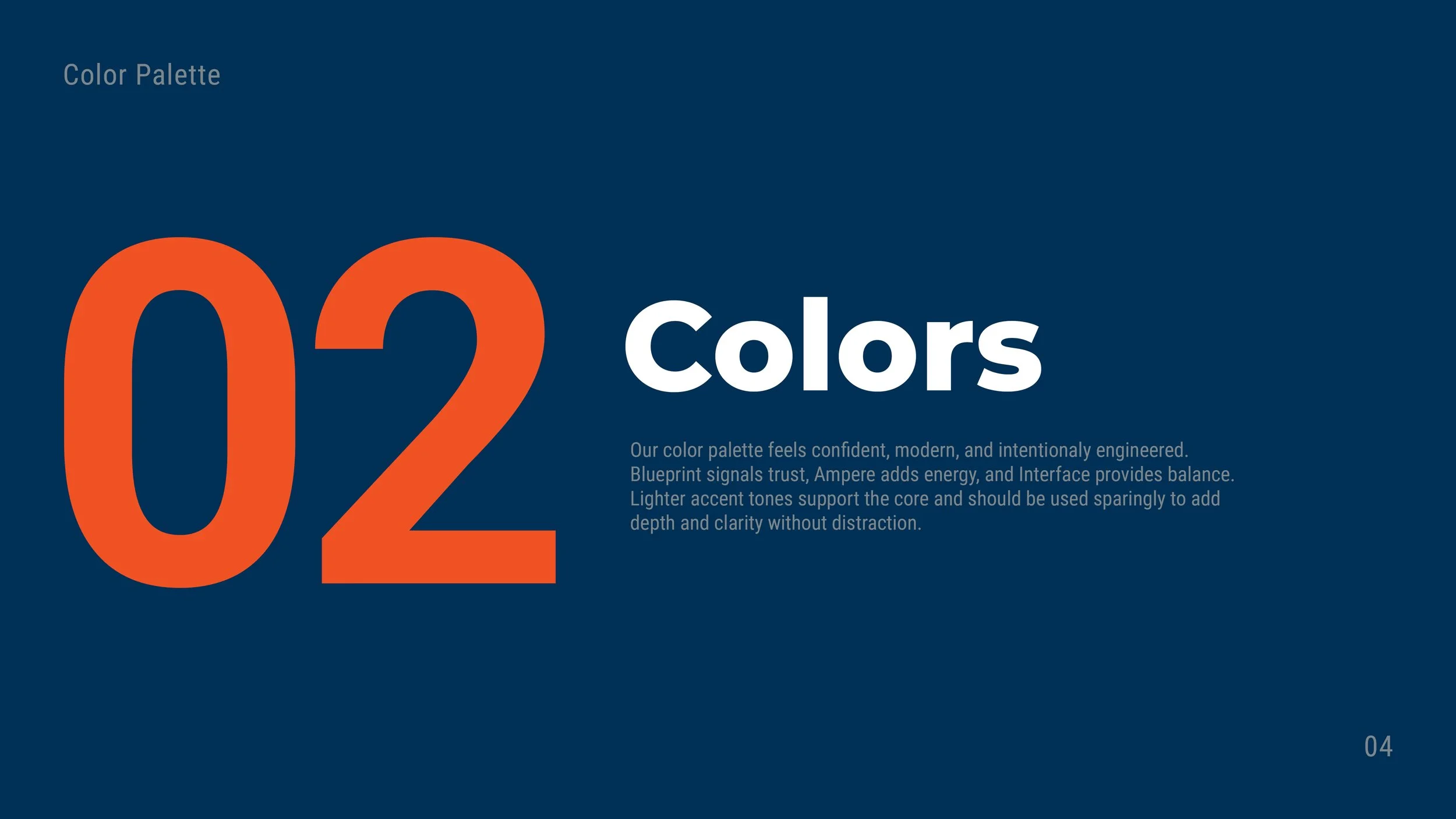
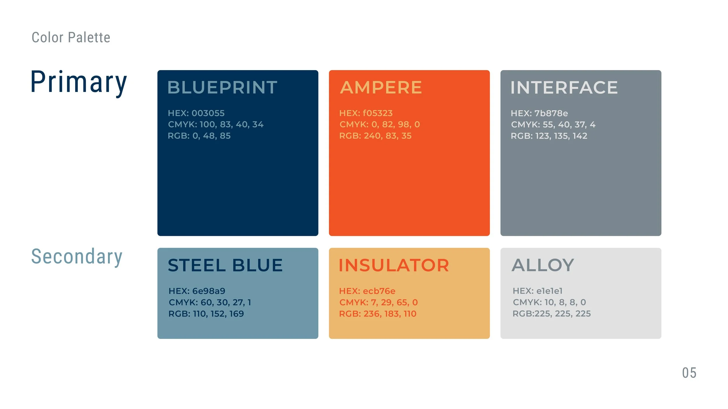
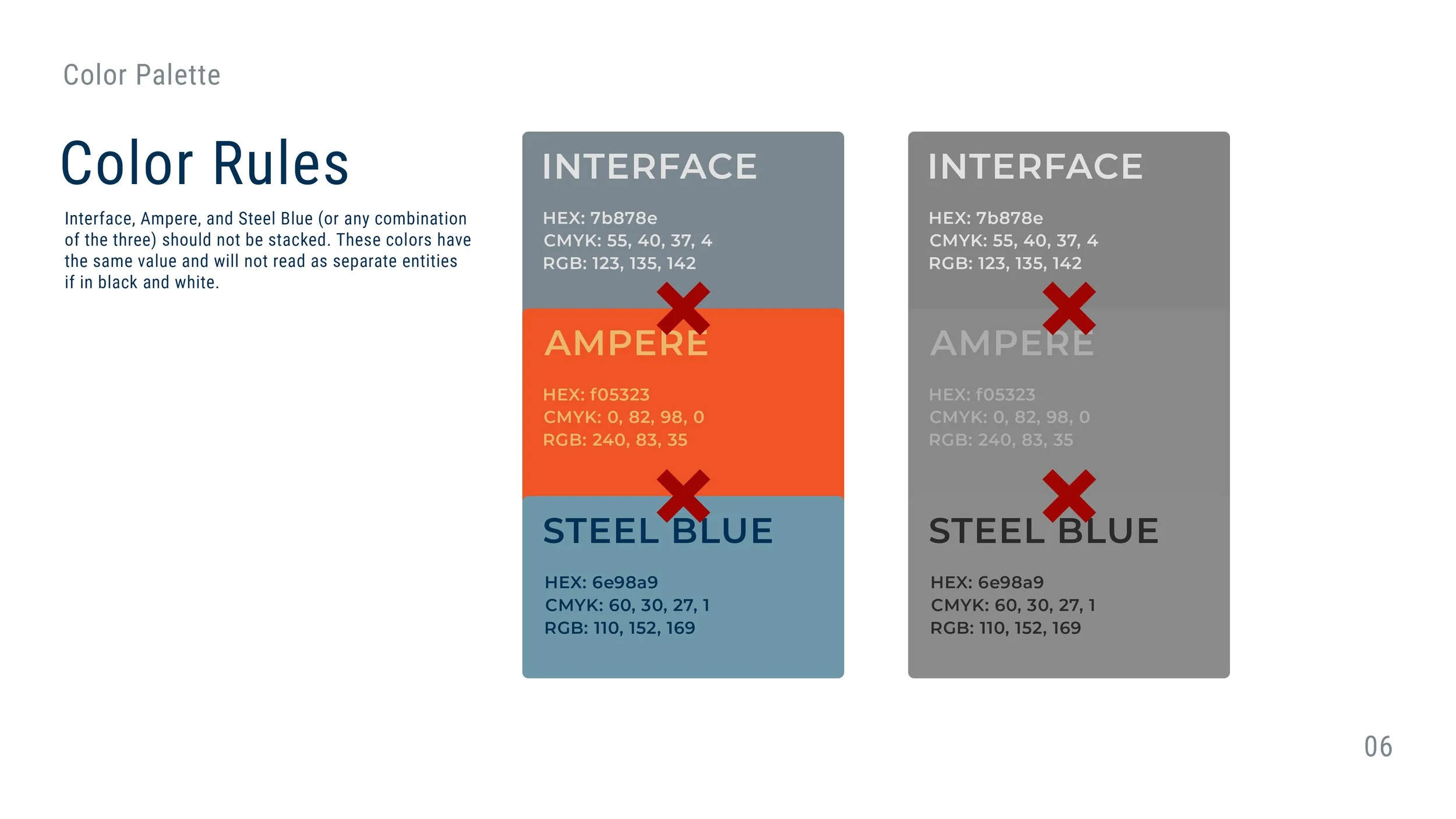
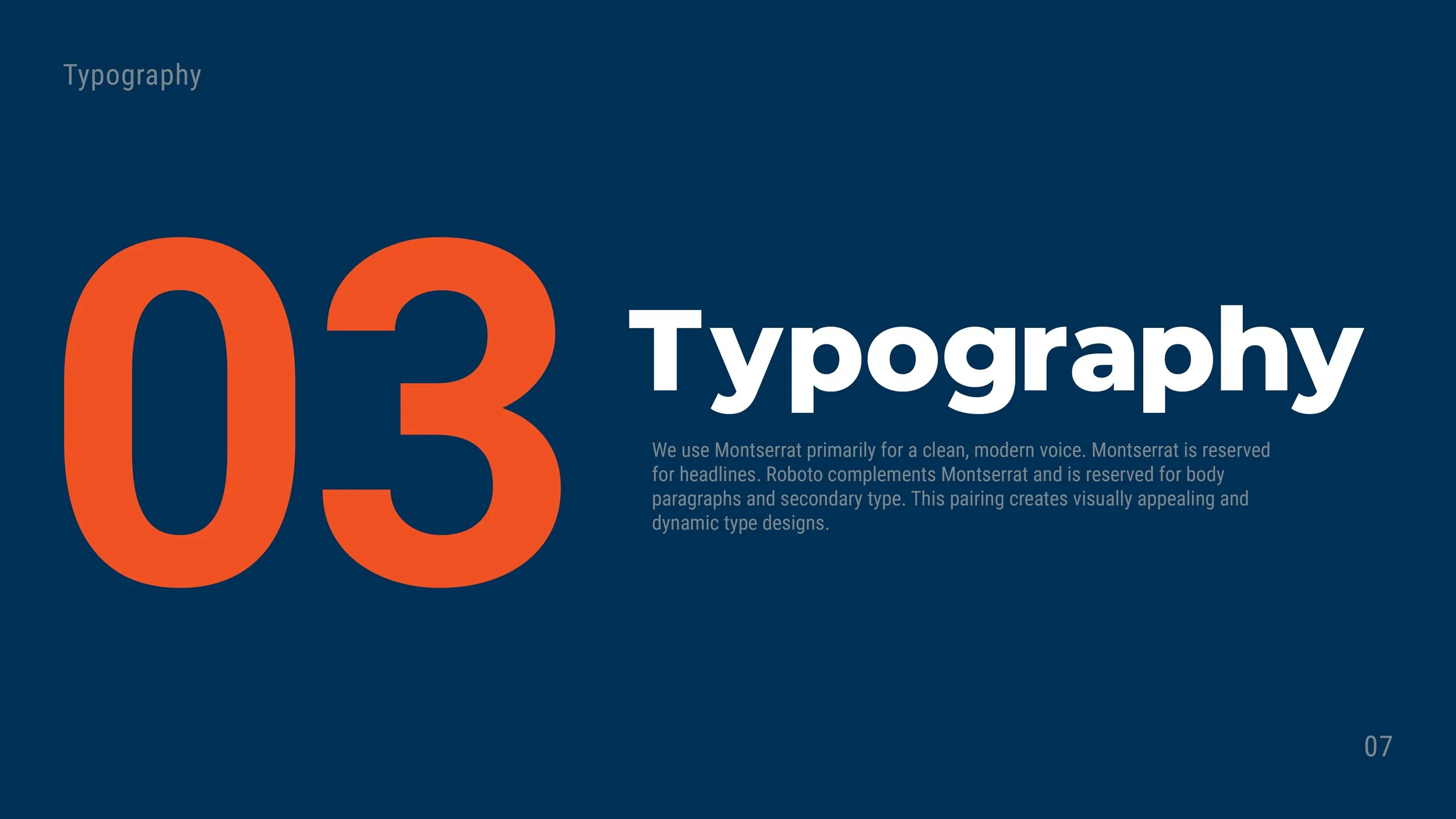
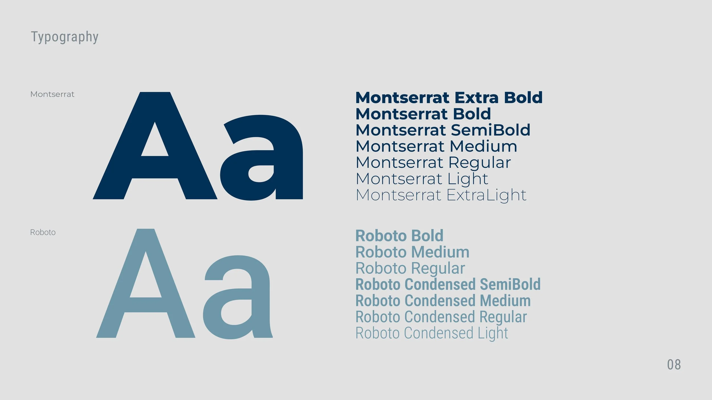
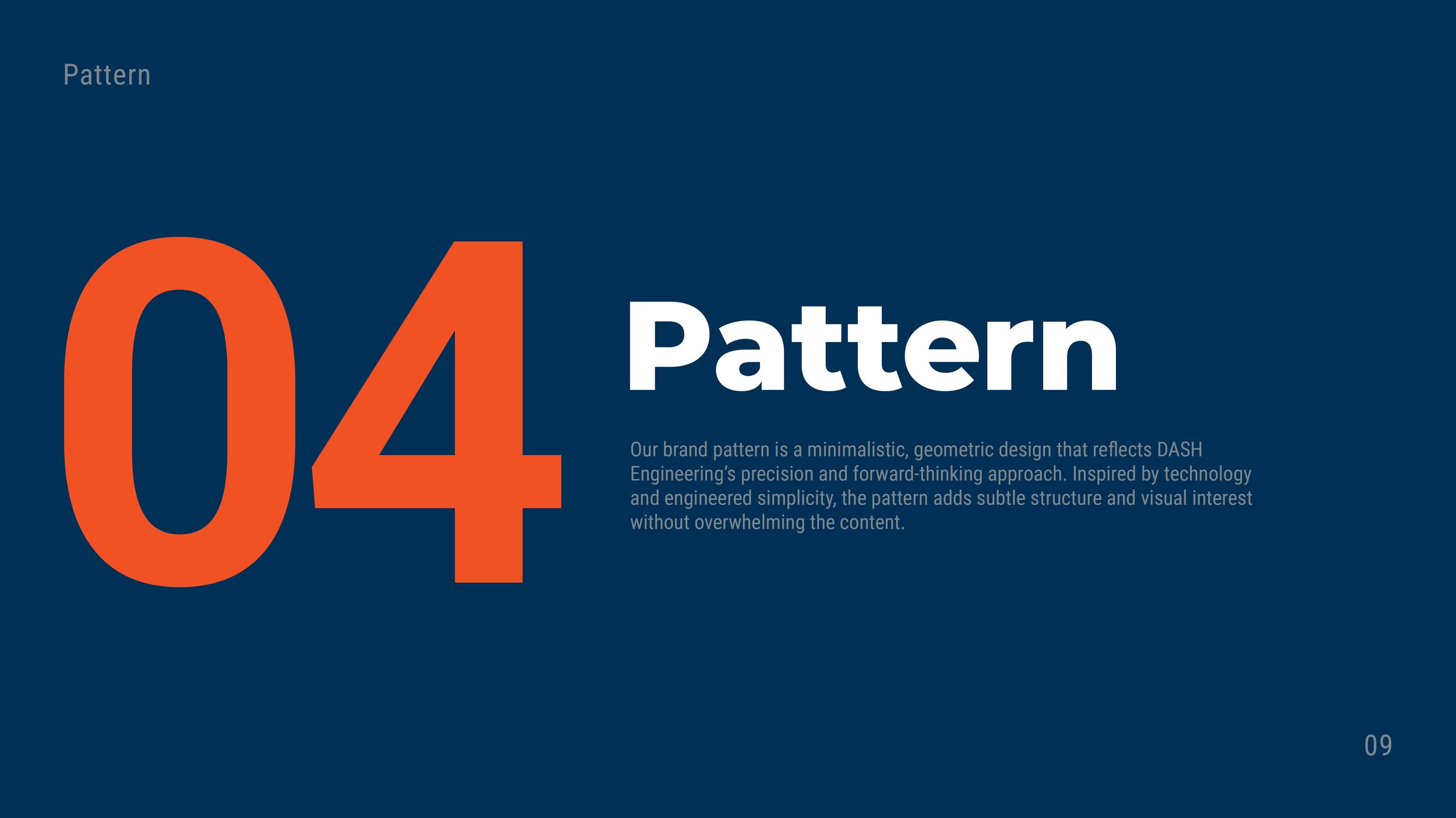
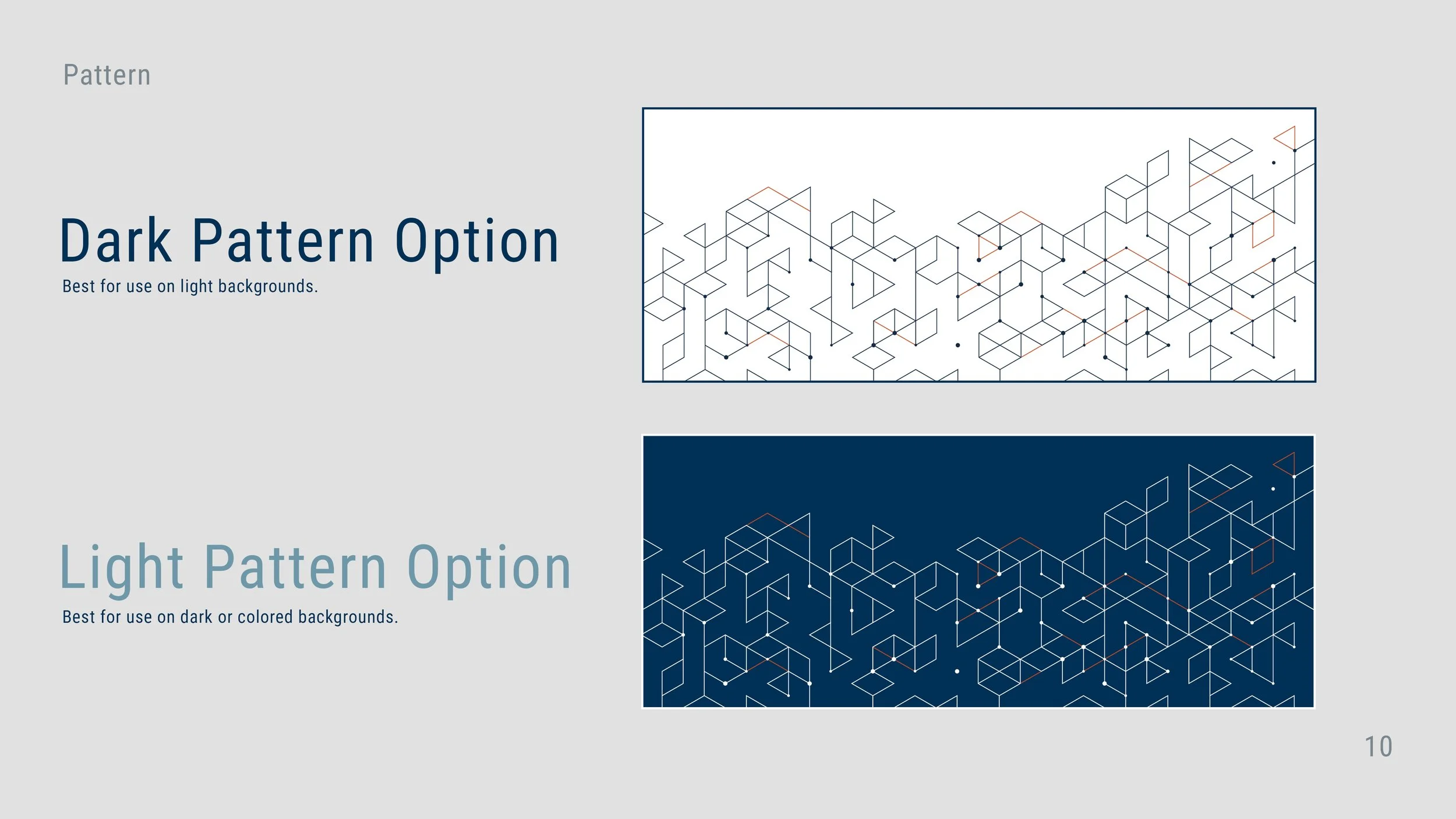
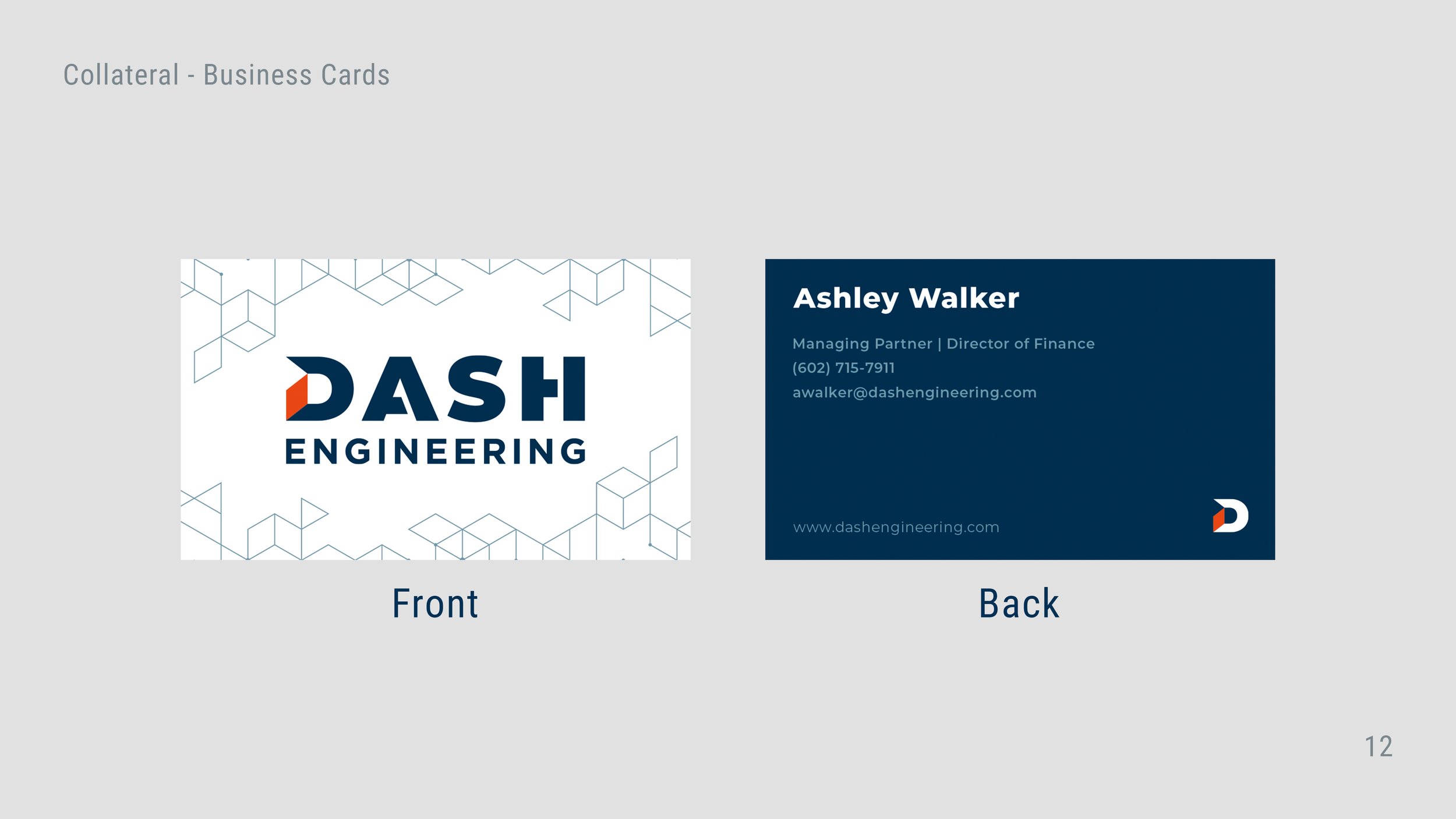
DASH's existing logo and colors became the foundation for a more complete brand system, including typography, visual rules, templates, messaging, and tone of voice.
The positioning and service messaging were also refined to make highly technical capabilities easier to understand without oversimplifying them for an engineering audience.
DIGITAL EXPERIENCE
A website built to work harder.
The DASH website was completely redesigned and rebuilt in Showit, including strategy, architecture, design, and copy.
The new site created a consistent home for the brand while making DASH's services, expertise, industries, and point of view easier to understand.
But the goal wasn't just a better-looking website. It needed a reason for people to come back.
CONTENT THAT CREATES TRAFFIC
A consistent LinkedIn and content strategy gave DASH a regular voice in an industry where expertise matters.
At least one high-quality, branded LinkedIn post was published each week, supported by original articles and thought leadership designed around the problems manufacturers were actually facing.
500%
INCREASE IN ORGANIC SOCIAL TRAFFIC
Organic social traffic to the DASH website increased 500% period over period, driven primarily by LinkedIn.
50%+
ENGAGEMENT RATE
Traffic from both organic search and organic social generated engagement rates above 50%.
LEAD GENERATION
Turning expertise into an entry point.
To create a new way for prospective clients to engage with DASH, I developed the Manufacturing AI Readiness Assessment, an interactive website experience that helped manufacturers evaluate whether their operations were prepared for AI adoption.
Rather than gating the experience behind an email form, users received immediate value while being given a natural path to continue the conversation with DASH.
BUSINESS DEVELOPMENT
Marketing was paired with targeted outbound business development rather than waiting for inbound traffic alone.
Prospective companies and decision-makers were identified by industry, outbound email campaigns were developed, vendor relationships were pursued, and marketing materials were created to support outreach.
These efforts generated a small number of highly qualified opportunities during the engagement, including the lead that ultimately became a $300K contract in a new industry.
$300K
NEW BUSINESS
One lead generated through targeted business development ultimately became a $300K contract.
EVENTS + EXPERIENCES
Rather than treating industry conferences as simply events to attend, I developed a framework for turning them into targeted marketing opportunities.
Relevant conferences were identified and paired with pre-event prospect research, priority contacts, meeting strategies, messaging, and custom swag concepts designed to give DASH a more intentional presence on the ground.
THE RESULT
From inconsistent to intentional.
In a matter of months, DASH went from marketing without a dedicated owner or consistent system to a cohesive brand with an established voice, content cadence, redesigned digital presence, lead-generation infrastructure, business-development strategy, and a roadmap for continued growth.
The result wasn't just better-looking marketing. It was a foundation the company could continue building on.
BY THE NUMBERS
500%
ORGANIC SOCIAL GROWTH
50%+
ENGAGEMENT
$300K
NEW BUSINESS
250%
PROSPECT DATABASE GROWTH
BRITT TRAVIS CREATIVE HEALING
An identity built around who we are and who we're becoming.
Building an approachable identity around growth, self-discovery, and being human.
Brand Strategy / Visual Identity / Art Direction / Brand Guidelines / Social
THE CHALLENGE
Make healing feel approachable.
Creative Healing began with a name and an idea. Everything else needed to be built from the ground up.
The most important part of the brief was approachability. The brand needed to create a welcoming, inclusive space for deeply personal work without feeling clinical or intimidating.
The goal was to build an identity that felt clean and considered, but still warm, organic, and unmistakably human.
THE IDEA
Identity, meet growth.
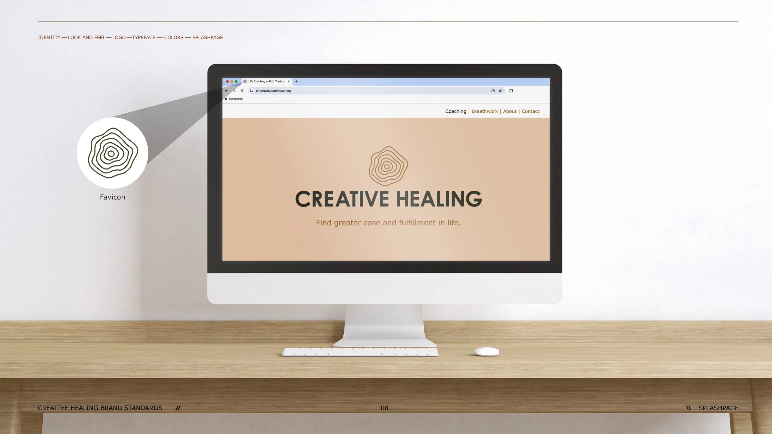
At the center of the brand is an icon inspired by two forms: a fingerprint and the rings of a tree.
The fingerprint represents individuality and identity. Tree rings reference growth, change, and the experiences that shape us over time.
Bringing the two together created a mark that could represent the work of Creative Healing without illustrating it literally: personal, imperfect, evolving and human.

THE VISUAL IDENTITY
Designed to feel like a place you could exhale.
The visual system grew from the same idea of approachability.
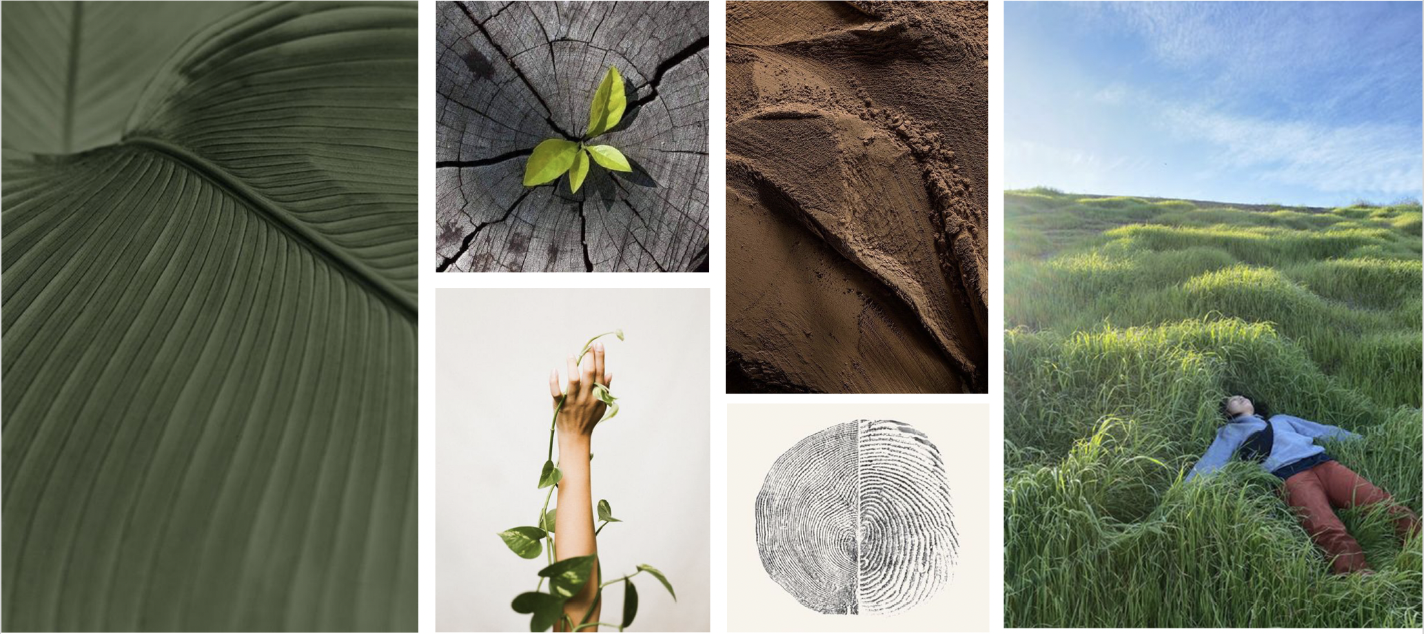
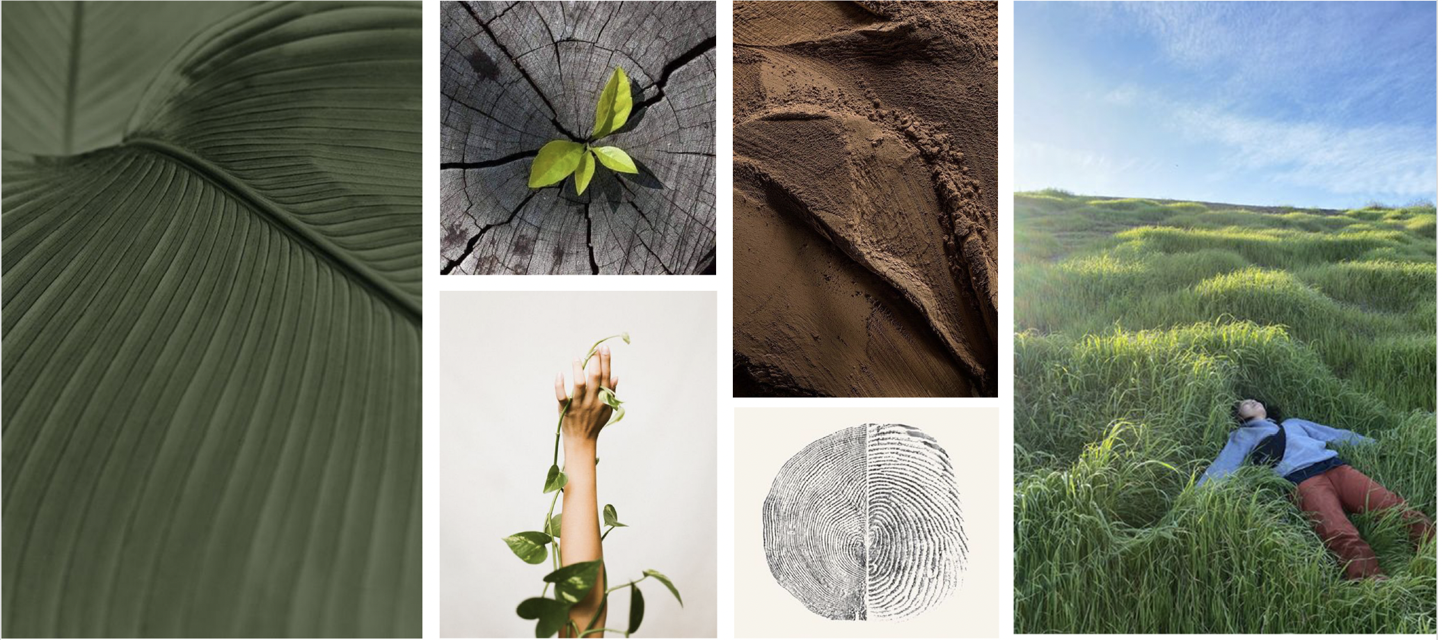
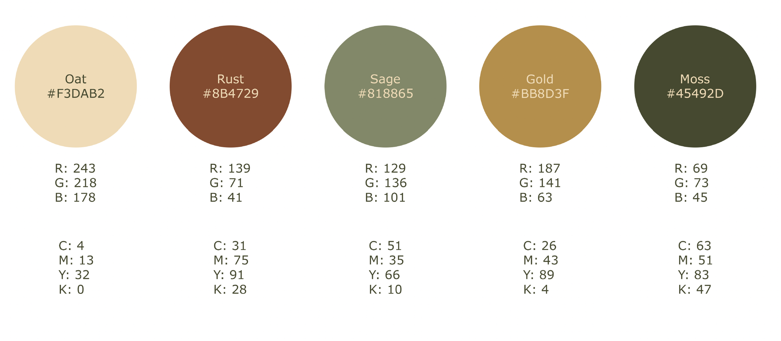
An earthy palette, organic forms and nature-inspired imagery soften the identity, while clean typography and restrained layouts keep the brand contemporary and considered.
The result balances two sides of Creative Healing: the vulnerability of the work itself and the optimism of what growth can look like.
A SYSTEM BUILT TO GROW
A brand needs to work beyond the logo.
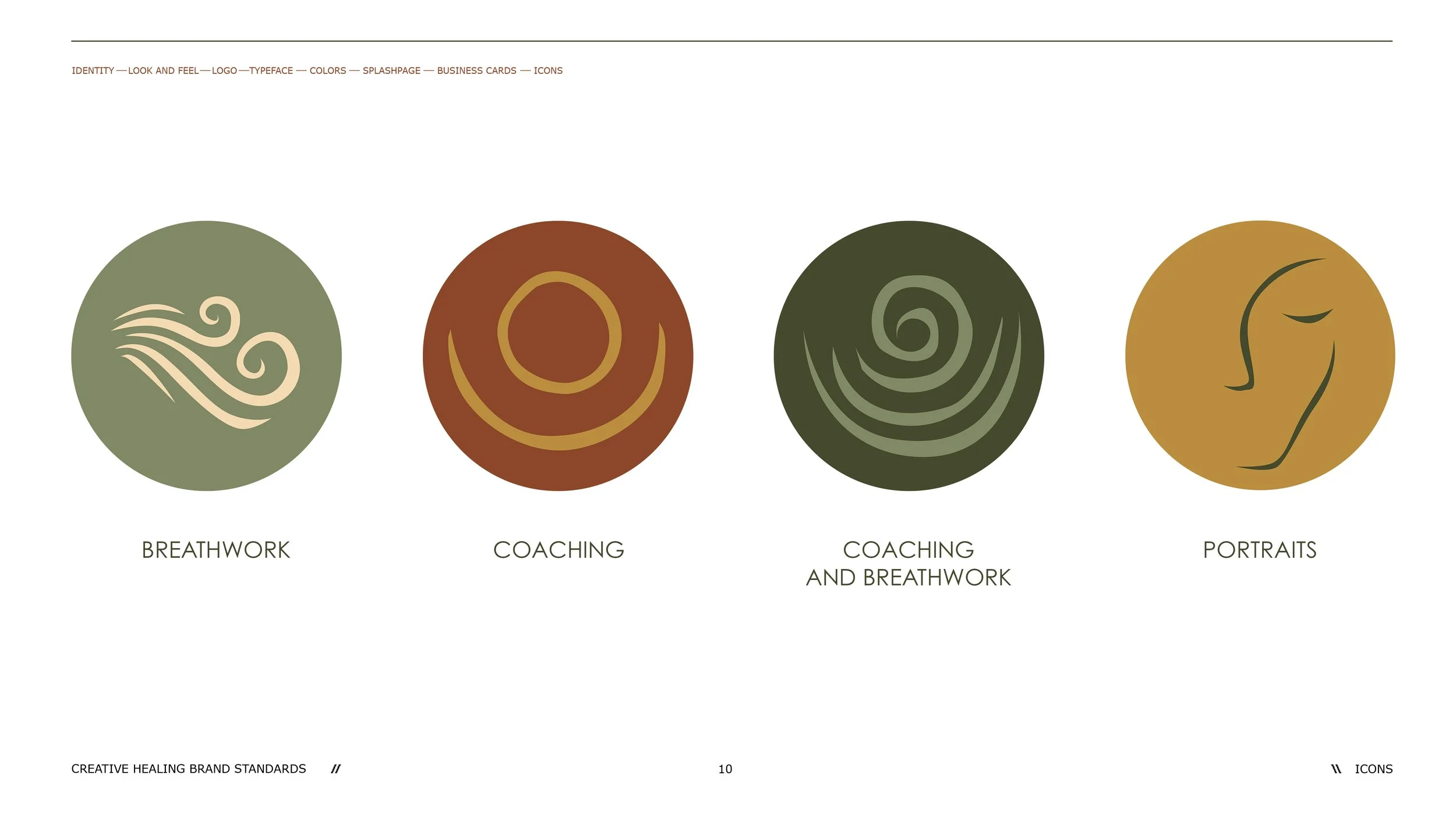
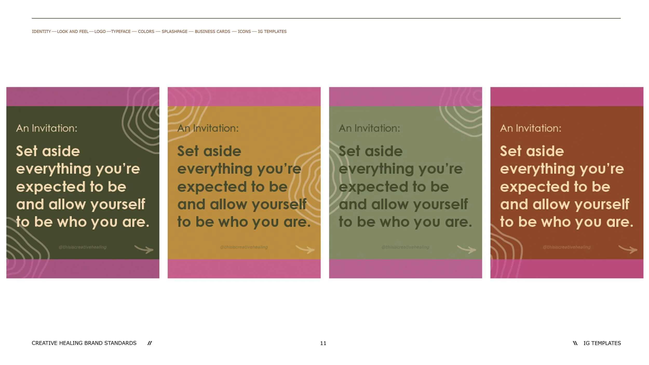
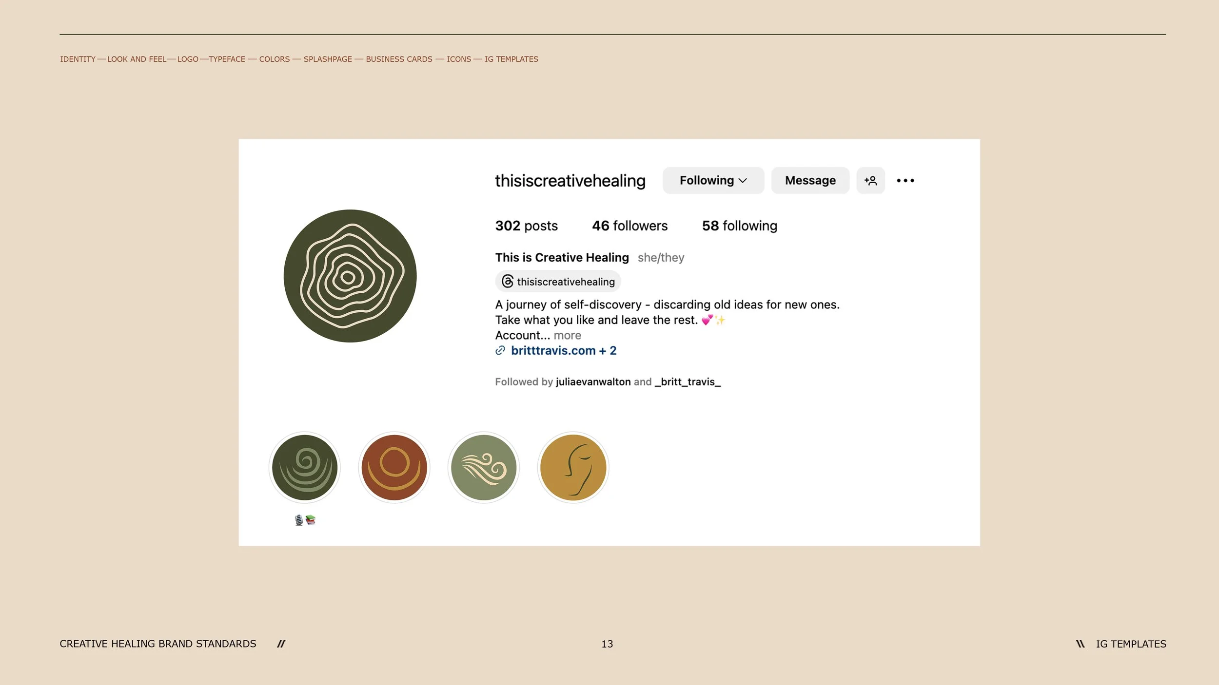
The identity was expanded into a flexible system of service icons, business cards, digital applications and social templates, giving Creative Healing a consistent visual language that could evolve alongside the business.
DESIGNED FOR EVERYONE
Inclusivity wasn't an afterthought.
Because Creative Healing was intended to be an inclusive space, accessibility became part of the brand-building process itself.
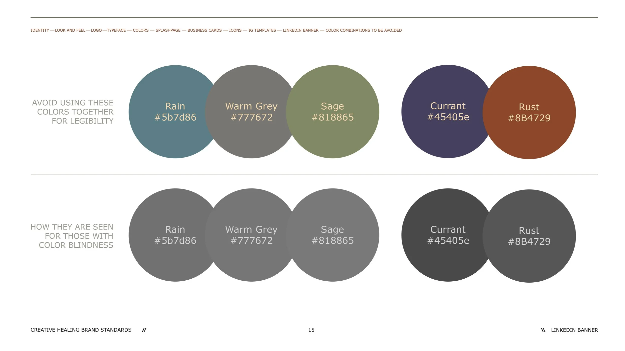
The color system was evaluated for color-vision accessibility, and guidelines were established around combinations that could become difficult to distinguish for people with color blindness.
That thinking was documented directly within the brand guidelines so accessibility could remain part of the identity as the brand grew.
THE RESULT
A brand with room to grow.
Creative Healing launched with a complete visual identity built around the same principle as the business itself: growth starts with being human.
From the central mark to the color system, typography, imagery, service icons and social applications, every element was designed to make the brand feel approachable, cohesive and inclusive from its first interaction.

LORRAINE WILLIAM CREATIVE
A refined identity designed down to the details.
Building a refined identity for a creative brand that makes moments feel unforgettable.
Brand Strategy / Visual Identity / Art Direction / Brand Guidelines / Social
THE CHALLENGE
Start with a name. Build everything else.
Lorraine William Creative began with just that: a name.
The business needed an identity that could communicate the elevated, highly considered nature of its work while still feeling personal and creative. The goal was to create something polished enough to feel premium, but expressive enough to capture the emotion and individuality behind every project.
From positioning and tone to the visual identity and its applications, the brand needed to be built from the ground up.
THE POSITIONING
The big picture is made in the details.
The brand strategy was built around Lorraine William Creative's ability to see both sides of creative work: the overall vision and the small details that make an experience feel considered.
The audience was defined broadly as anyone who wants a stress-free event created from start to finish, with the brand positioned around experience, attention to detail, and creating moments that feel effortless to the client.
The voice followed the same idea:
Crisp. Refined. Dashing. Inspiring. Luxurious. Memorable.
THE IDENTITY
Elegant without being expected.
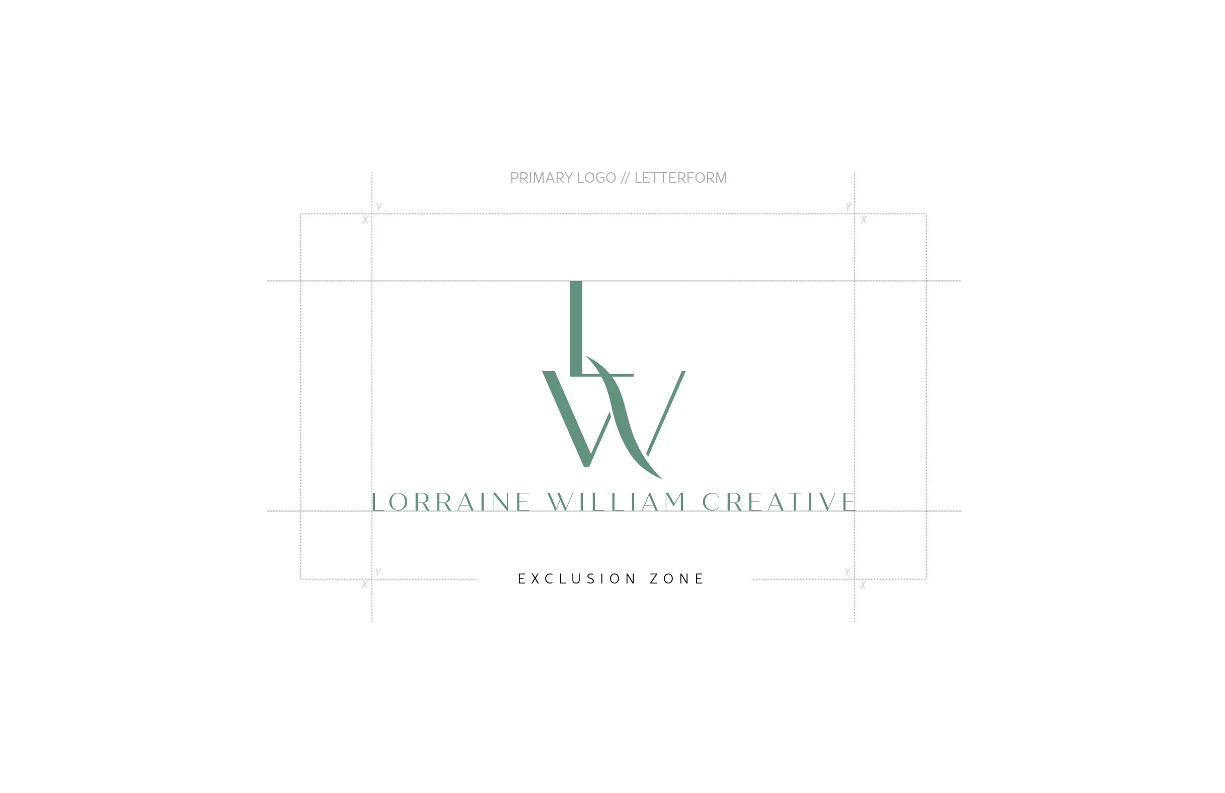
At the center of the identity is a custom LW monogram, designed with long, architectural letterforms and an overlapping construction that gives the mark its own recognizable silhouette.
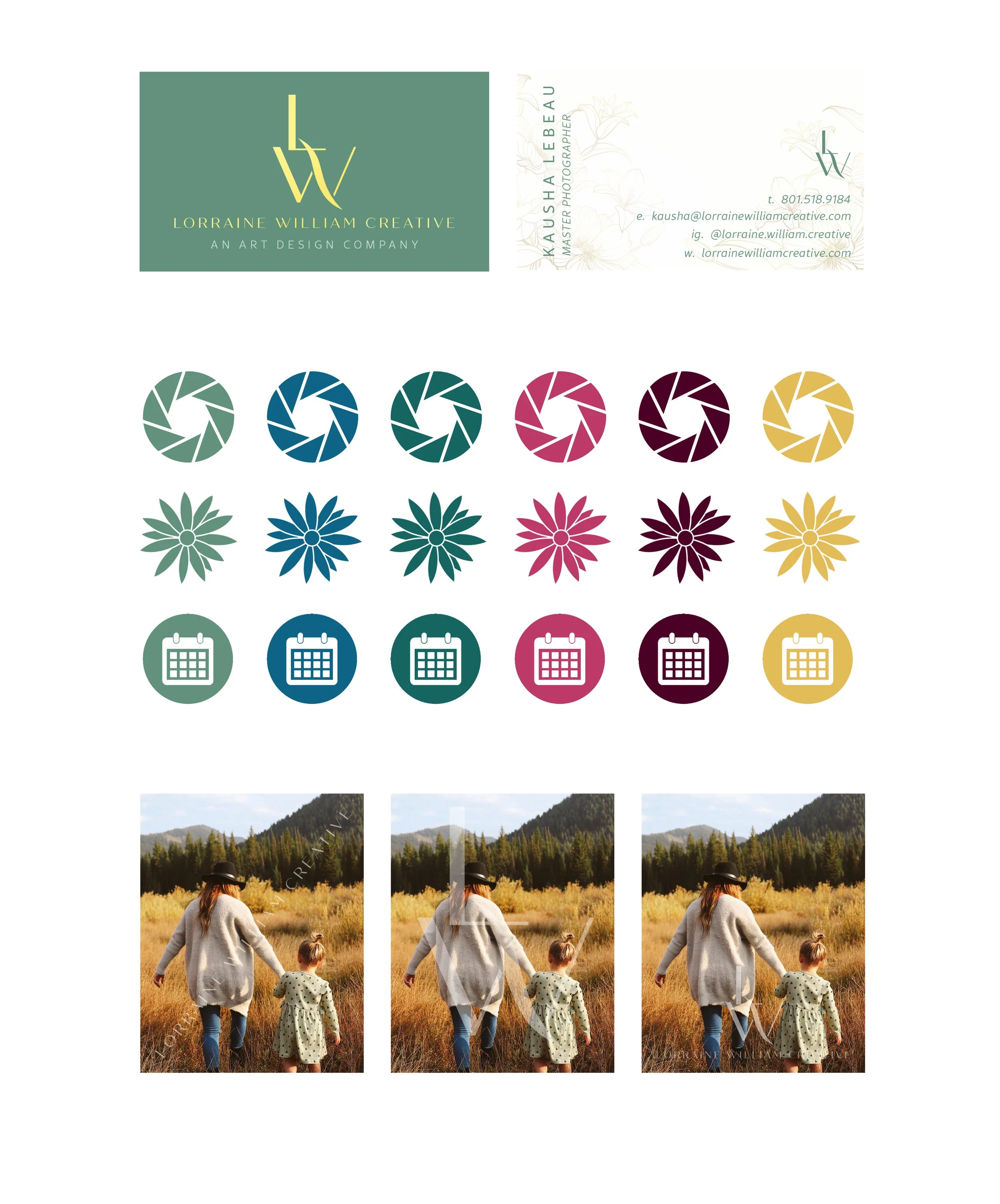
A family of logo lockups allows the identity to move between full-brand applications and smaller digital uses without losing recognition. The monogram was also developed across the complete brand palette, creating flexibility without sacrificing consistency.

COLOR + TYPE
A little refinement. A little personality.
Rather than relying on a traditionally neutral luxury palette, the identity uses color to give Lorraine William Creative personality.
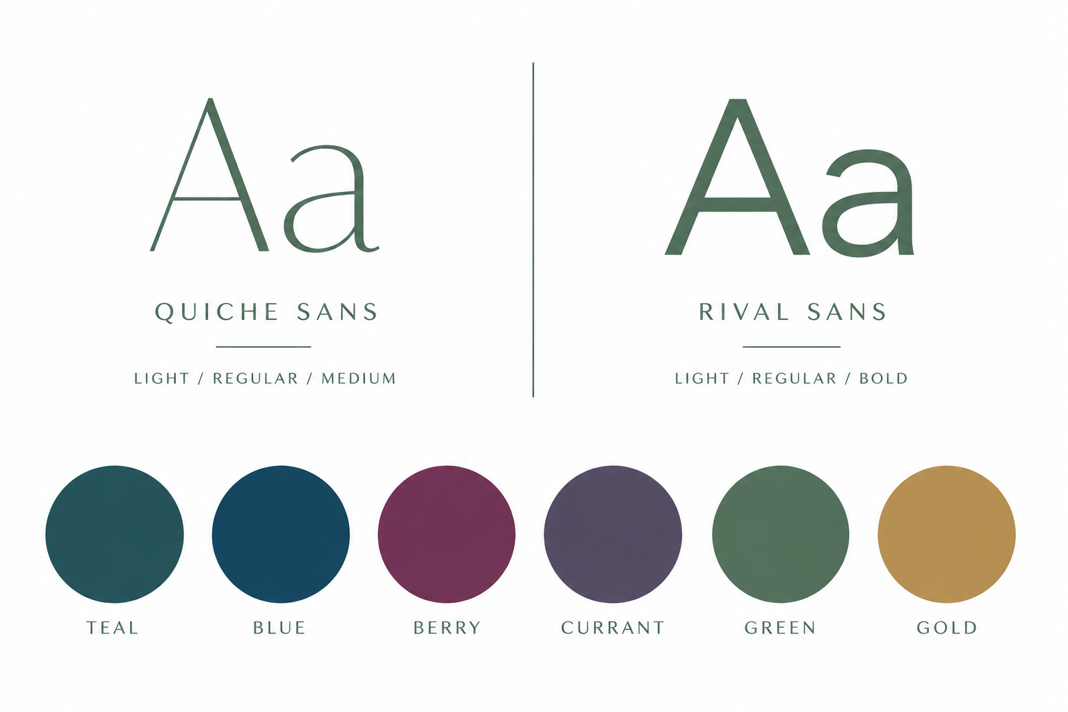
Deep teal, blue, berry, currant, green and gold create a system that can shift in mood while remaining recognizably part of the same brand.
Quiche Sans and Rival Sans provide the typographic foundation, pairing editorial elegance with clean, modern structure.
THE BRAND IN ACTION
Designed to work wherever the business shows up.
The identity was translated into a complete working system spanning business cards, iconography, stationery, social content, and photography applications.
Custom icon families created a consistent visual language for photography, floral, and event-related services, while social templates gave the brand enough flexibility to combine photography, messaging, and promotional content without losing its visual identity.
THE RESULT
One name became an entire visual world.
Lorraine William Creative started with a name and left with a complete brand system designed to feel refined, recognizable, and distinctly its own.
From strategy and positioning to the monogram, color, typography, collateral, social templates, and photography applications, every element was designed to work together while leaving enough flexibility for the brand to evolve.