
BRITT TRAVIS CREATIVE HEALING
Building an approachable identity around growth, self-discovery, and being human.
Brand Strategy / Visual Identity / Art Direction / Brand Guidelines / Social
THE CHALLENGE
Make healing feel approachable.
Creative Healing began with a name and an idea. Everything else needed to be built from the ground up.
The most important part of the brief was approachability. The brand needed to create a welcoming, inclusive space for deeply personal work without feeling clinical or intimidating.
The goal was to build an identity that felt clean and considered, but still warm, organic, and unmistakably human.

THE IDEA
Identity, meet growth.
At the center of the brand is an icon inspired by two forms: a fingerprint and the rings of a tree.
The fingerprint represents individuality and identity. Tree rings reference growth, change, and the experiences that shape us over time.
Bringing the two together created a mark that could represent the work of Creative Healing without illustrating it literally: personal, imperfect, evolving and human.

THE VISUAL IDENTITY
Designed to feel like a place you could exhale.
The visual system grew from the same idea of approachability.
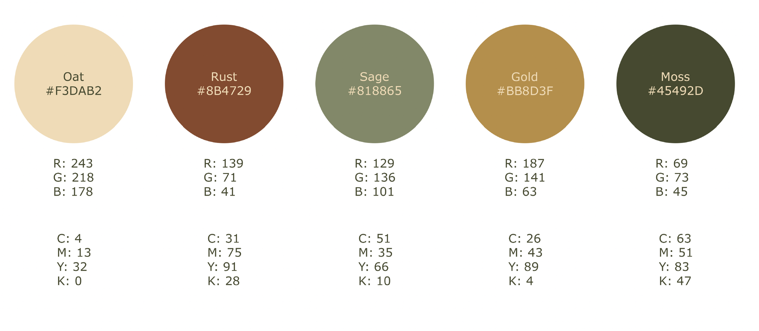
An earthy palette, organic forms and nature-inspired imagery soften the identity, while clean typography and restrained layouts keep the brand contemporary and considered.
The result balances two sides of Creative Healing: the vulnerability of the work itself and the optimism of what growth can look like.
A SYSTEM BUILT TO GROW
A brand needs to work beyond the logo.
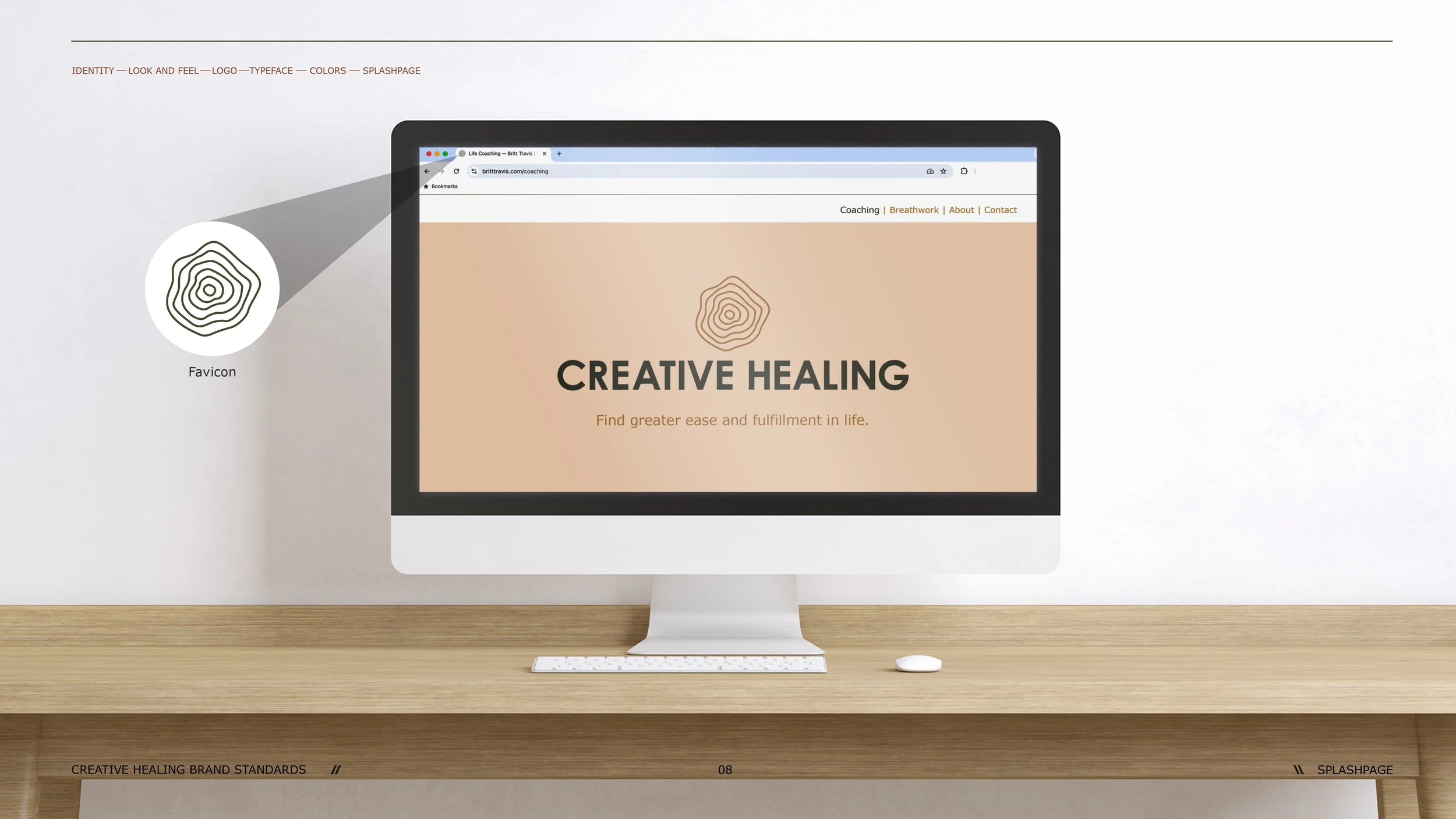
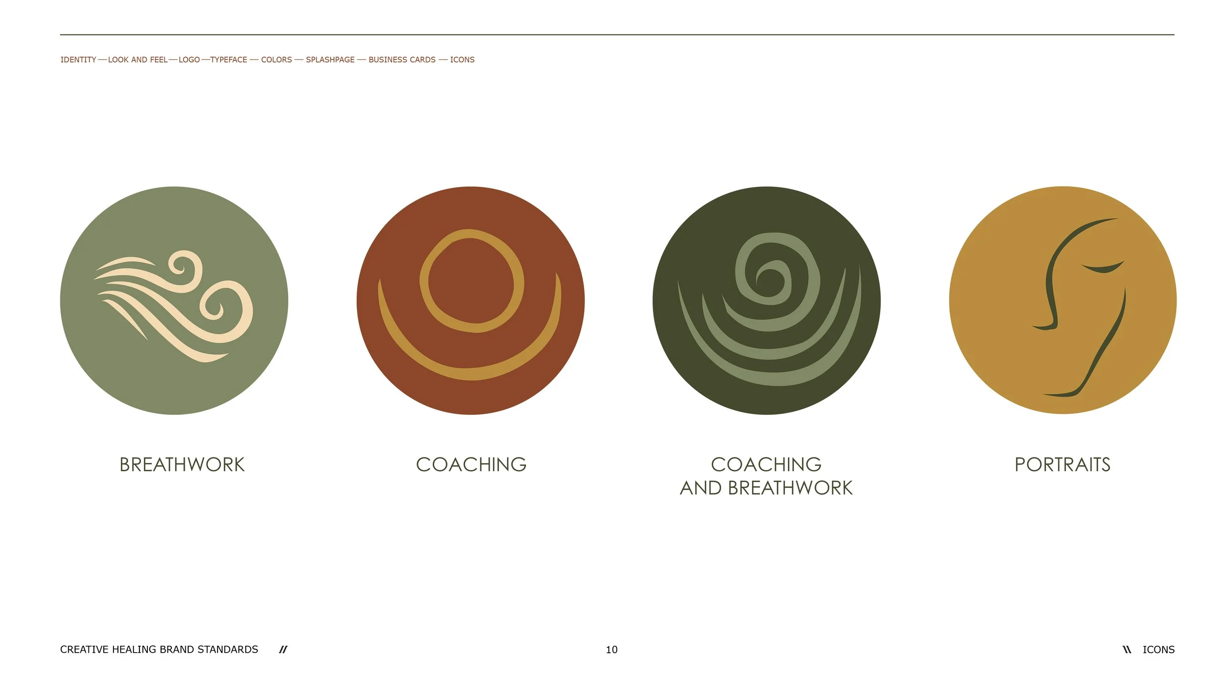
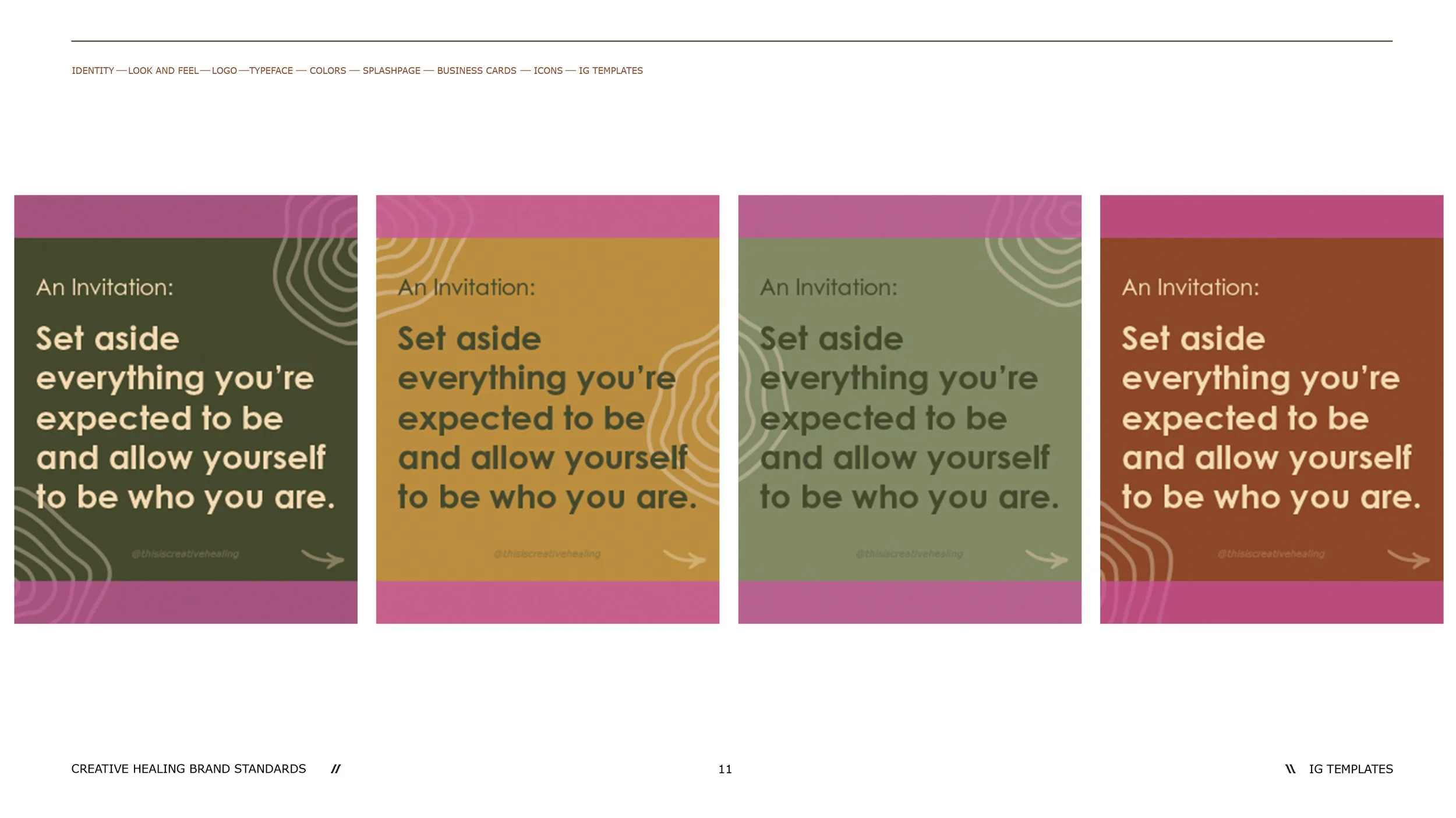
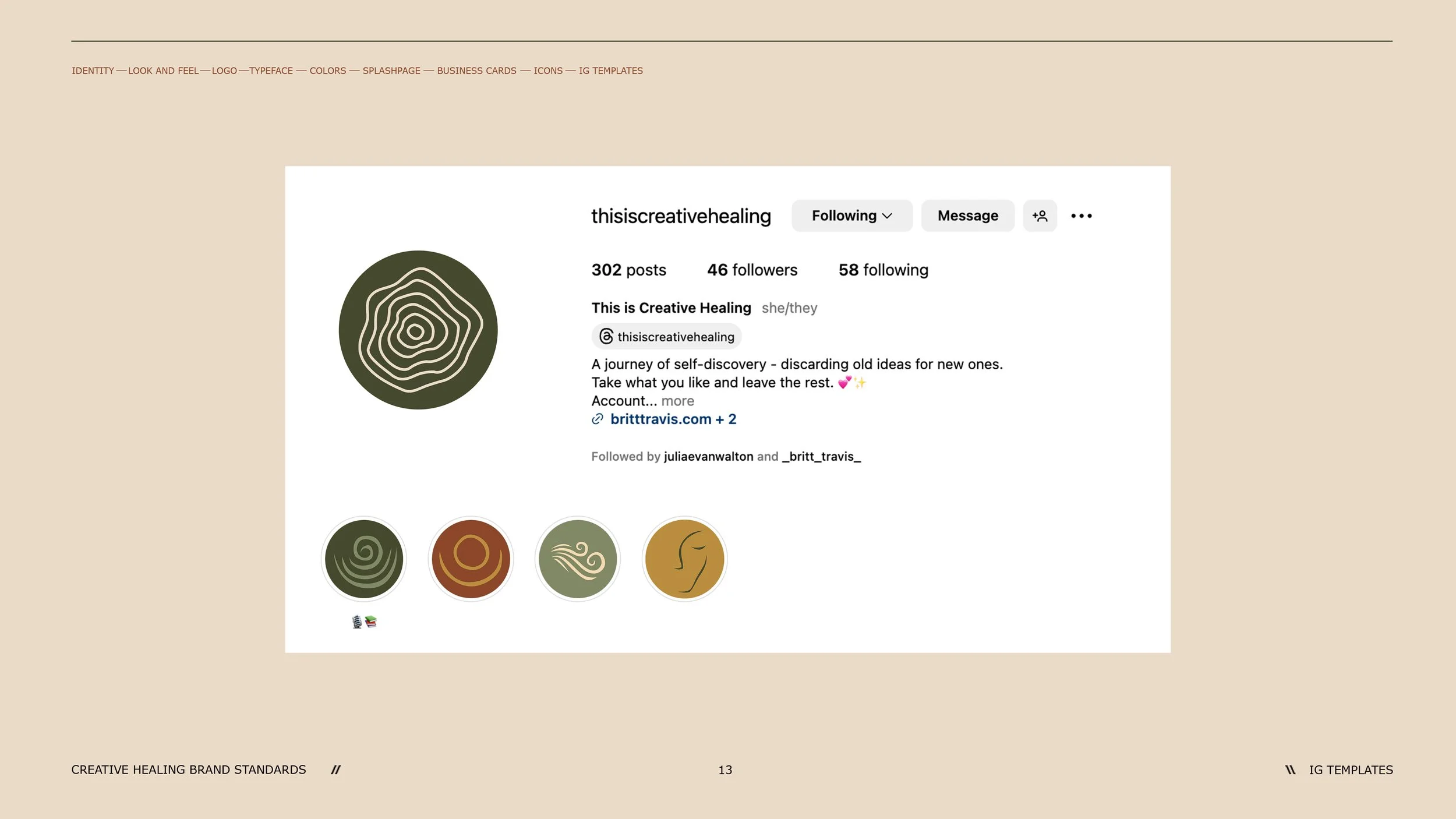
The identity was expanded into a flexible system of service icons, business cards, digital applications and social templates, giving Creative Healing a consistent visual language that could evolve alongside the business.
DESIGNED FOR EVERYONE
Inclusivity wasn't an afterthought.
Because Creative Healing was intended to be an inclusive space, accessibility became part of the brand-building process itself.
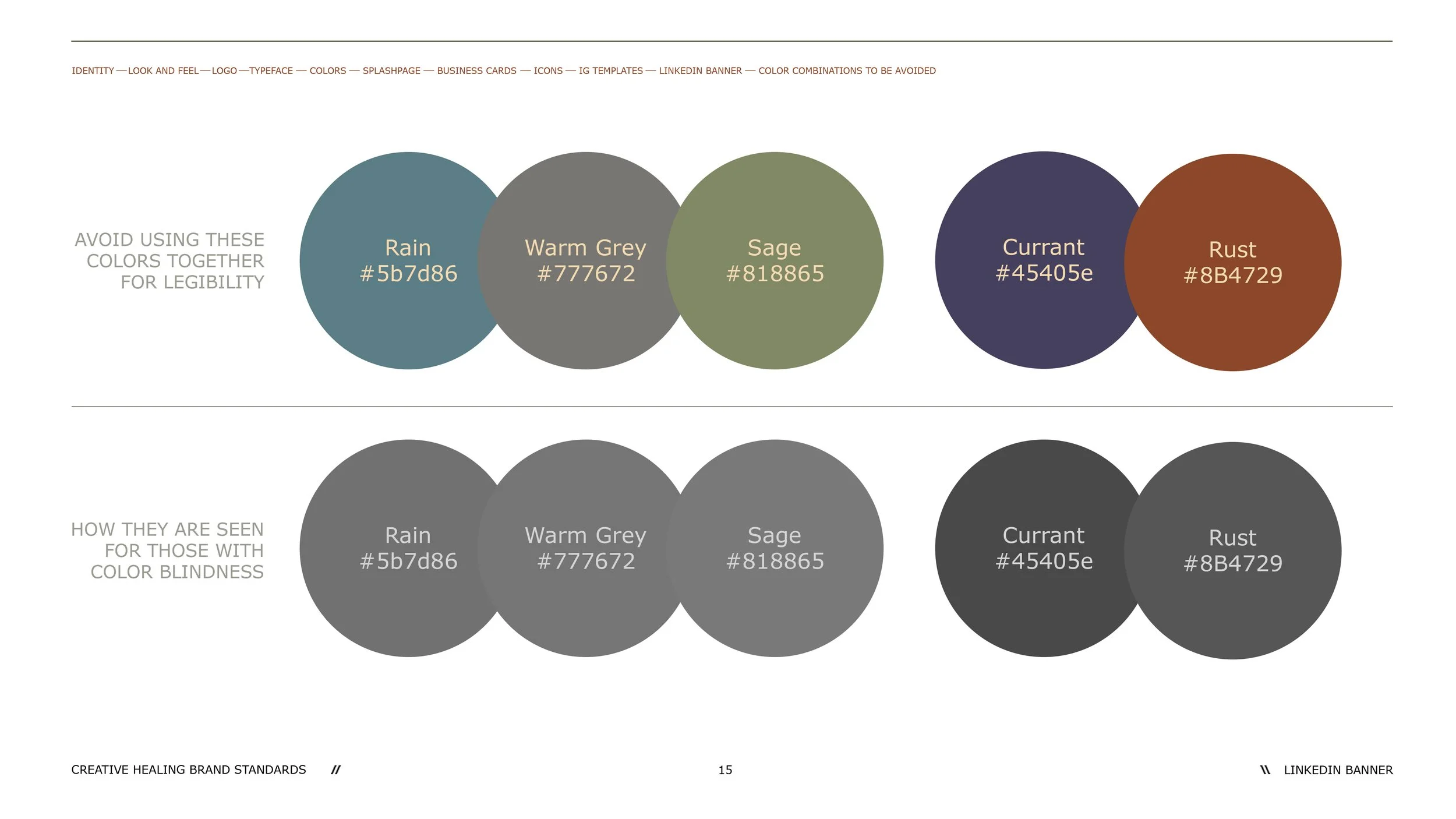
The color system was evaluated for color-vision accessibility, and guidelines were established around combinations that could become difficult to distinguish for people with color blindness.
That thinking was documented directly within the brand guidelines so accessibility could remain part of the identity as the brand grew.
THE RESULT
A brand with room to grow.
Creative Healing launched with a complete visual identity built around the same principle as the business itself: growth starts with being human.
From the central mark to the color system, typography, imagery, service icons and social applications, every element was designed to make the brand feel approachable, cohesive and inclusive from its first interaction.