
LORRAINE WILLIAM CREATIVE
Building a refined identity for a creative brand that makes moments feel unforgettable.
Brand Strategy / Visual Identity / Art Direction / Brand Guidelines / Social
THE CHALLENGE
Start with a name. Build everything else.
Lorraine William Creative began with just that: a name.
The business needed an identity that could communicate the elevated, highly considered nature of its work while still feeling personal and creative. The goal was to create something polished enough to feel premium, but expressive enough to capture the emotion and individuality behind every project.
From positioning and tone to the visual identity and its applications, the brand needed to be built from the ground up.
THE POSITIONING
The big picture is made in the details.
The brand strategy was built around Lorraine William Creative's ability to see both sides of creative work: the overall vision and the small details that make an experience feel considered.
The audience was defined broadly as anyone who wants a stress-free event created from start to finish, with the brand positioned around experience, attention to detail, and creating moments that feel effortless to the client.
The voice followed the same idea:
Crisp. Refined. Dashing. Inspiring. Luxurious. Memorable.
THE IDENTITY
Elegant without being expected.
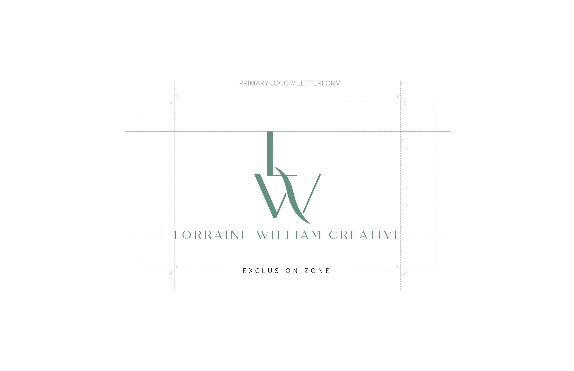
At the center of the identity is a custom LW monogram, designed with long, architectural letterforms and an overlapping construction that gives the mark its own recognizable silhouette.
A family of logo lockups allows the identity to move between full-brand applications and smaller digital uses without losing recognition. The monogram was also developed across the complete brand palette, creating flexibility without sacrificing consistency.

COLOR + TYPE
A little refinement. A little personality.
Rather than relying on a traditionally neutral luxury palette, the identity uses color to give Lorraine William Creative personality.
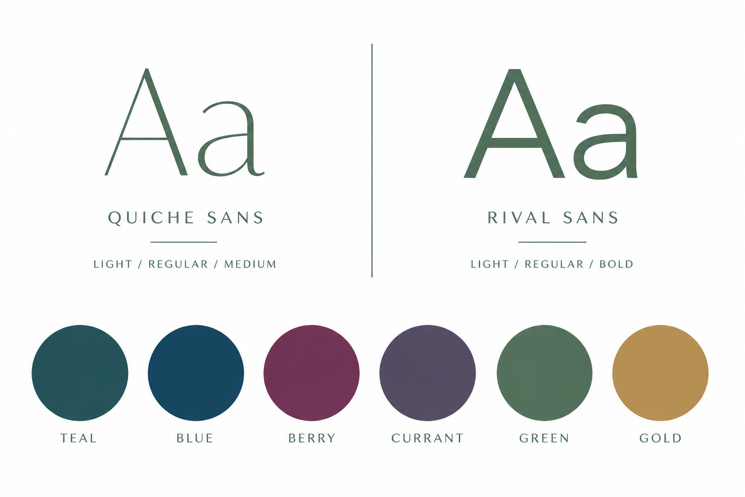
Deep teal, blue, berry, currant, green and gold create a system that can shift in mood while remaining recognizably part of the same brand.
Quiche Sans and Rival Sans provide the typographic foundation, pairing editorial elegance with clean, modern structure.
THE BRAND IN ACTION
Designed to work wherever the business shows up.
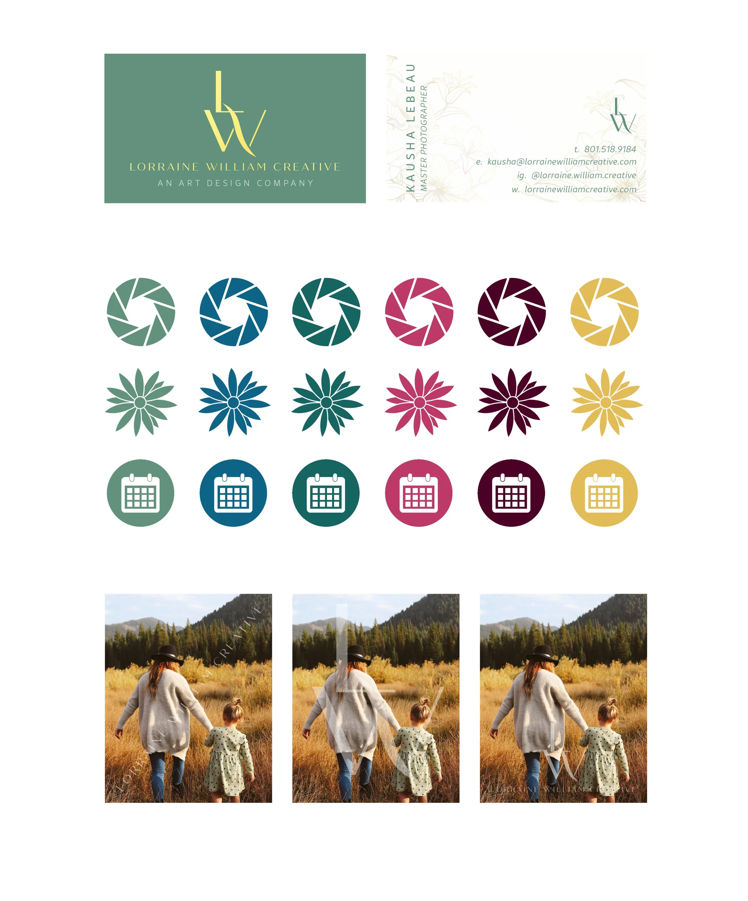
The identity was translated into a complete working system spanning business cards, iconography, stationery, social content, and photography applications.
Custom icon families created a consistent visual language for photography, floral, and event-related services, while social templates gave the brand enough flexibility to combine photography, messaging, and promotional content without losing its visual identity.
THE RESULT
One name became an entire visual world.
Lorraine William Creative started with a name and left with a complete brand system designed to feel refined, recognizable, and distinctly its own.
From strategy and positioning to the monogram, color, typography, collateral, social templates, and photography applications, every element was designed to work together while leaving enough flexibility for the brand to evolve.